
CHALEUR
Corporate Identity Design
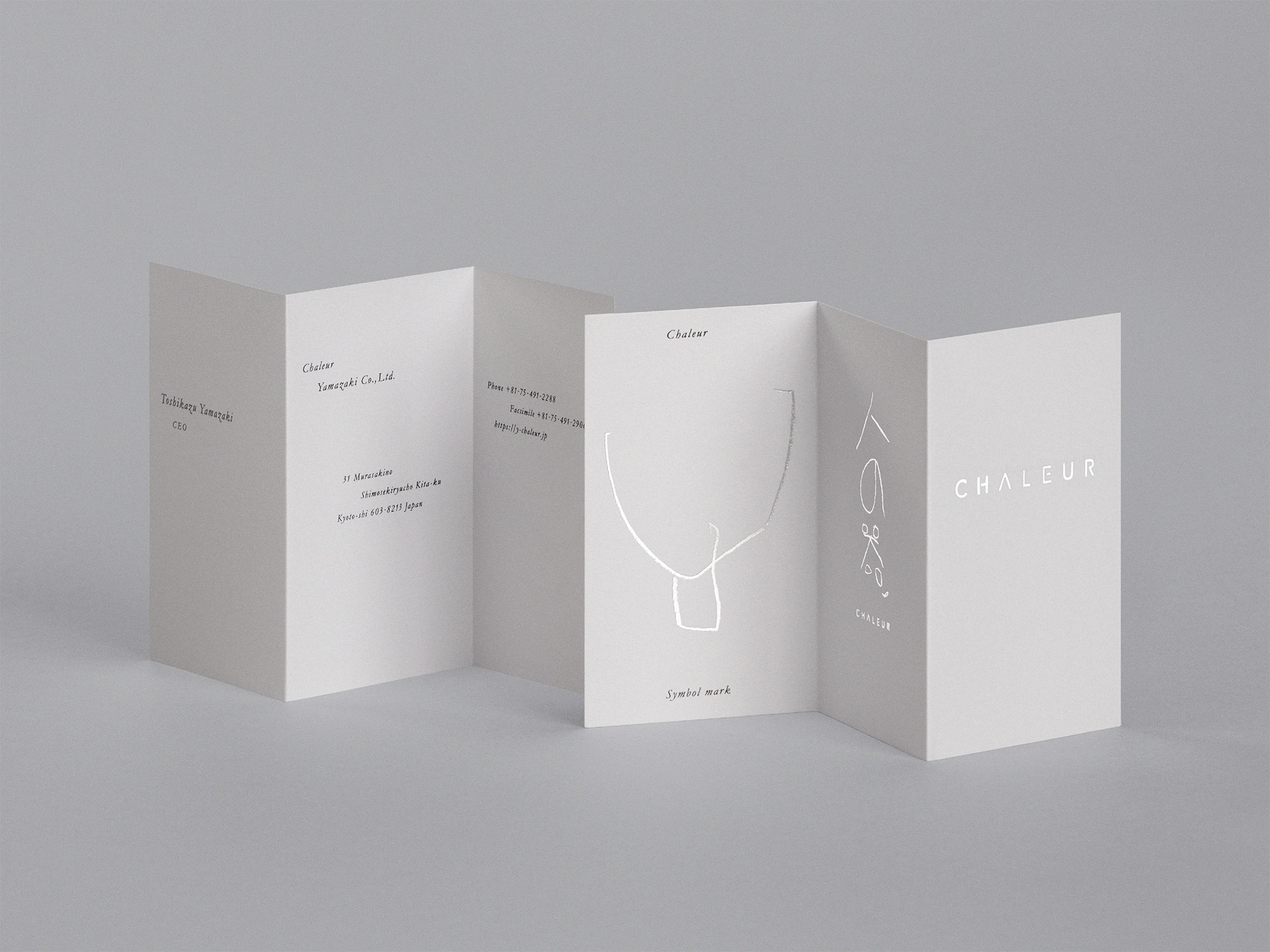
Business Card
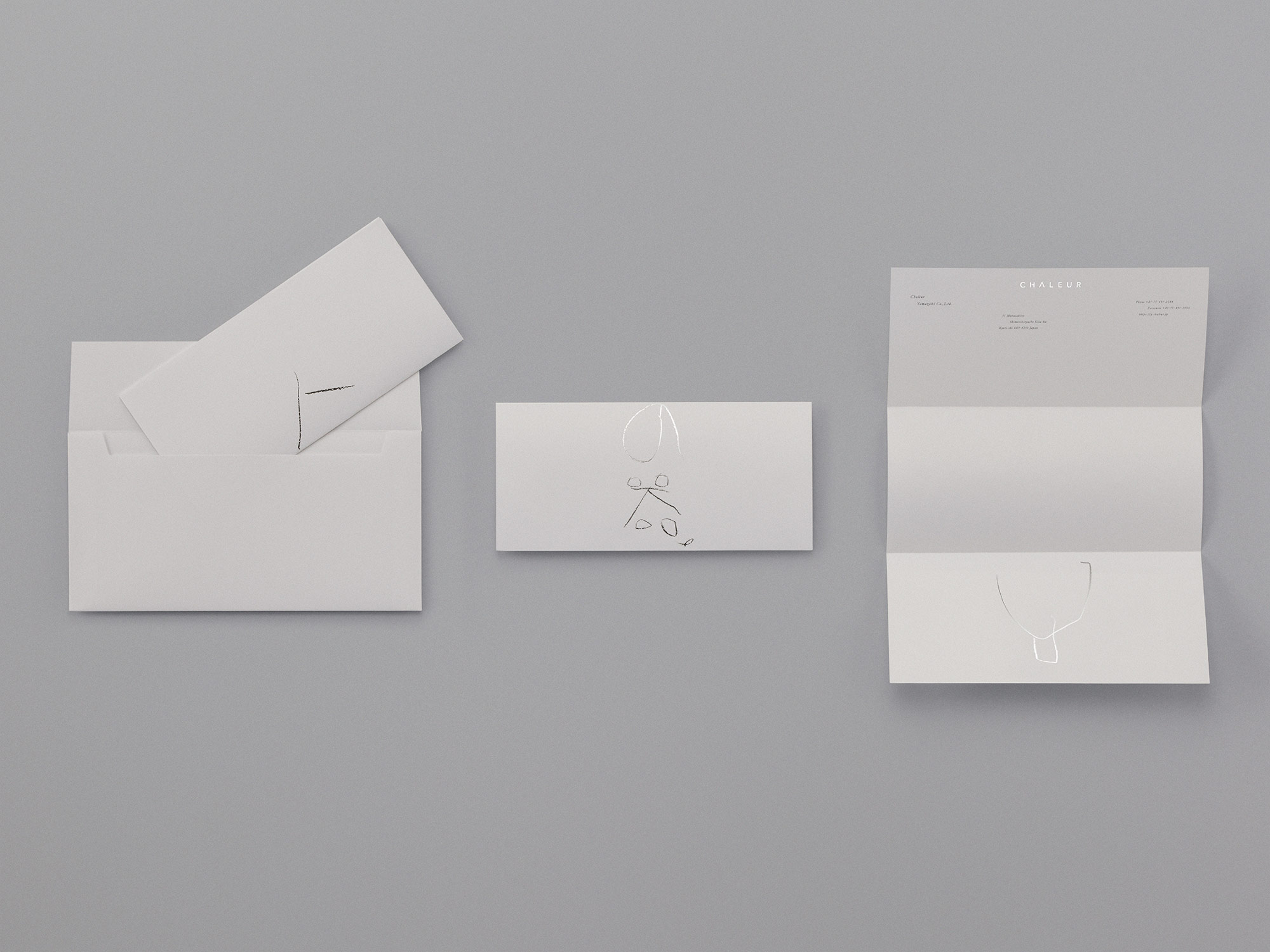
Letterhead
DL Envelope
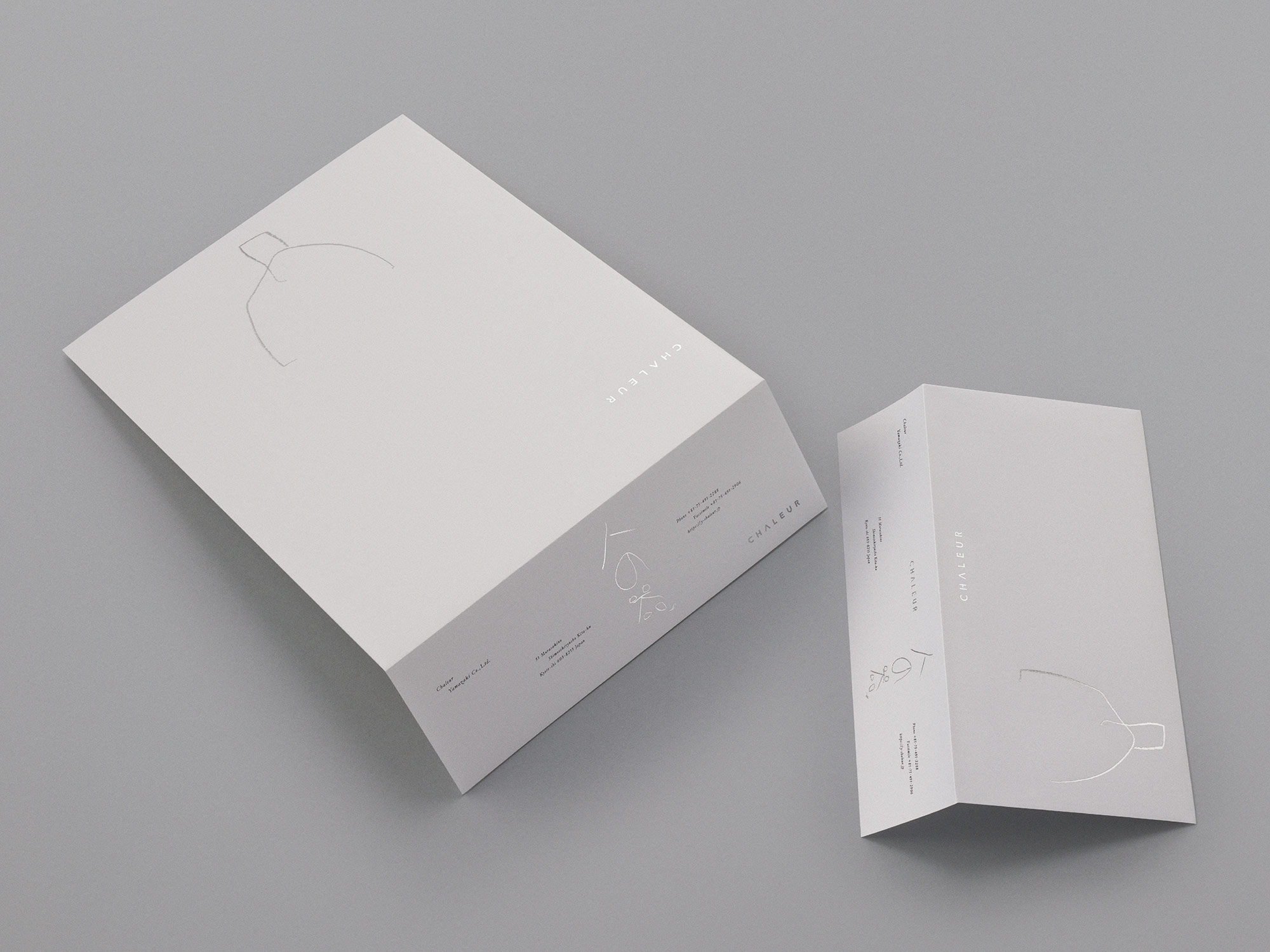
C4 Envelope
DL Envelope
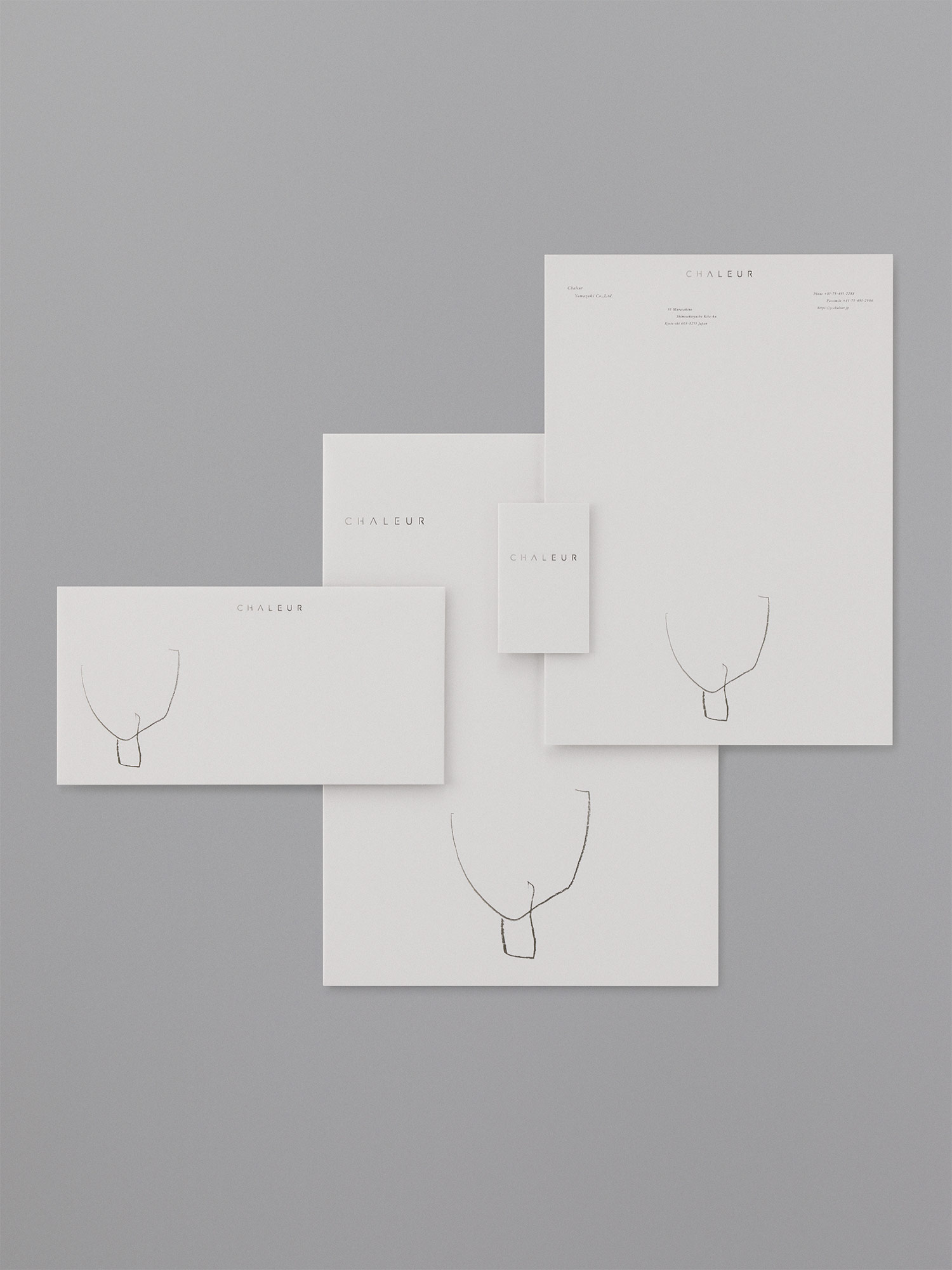
Business Card
Letterhead
C4 Envelope
DL Envelope
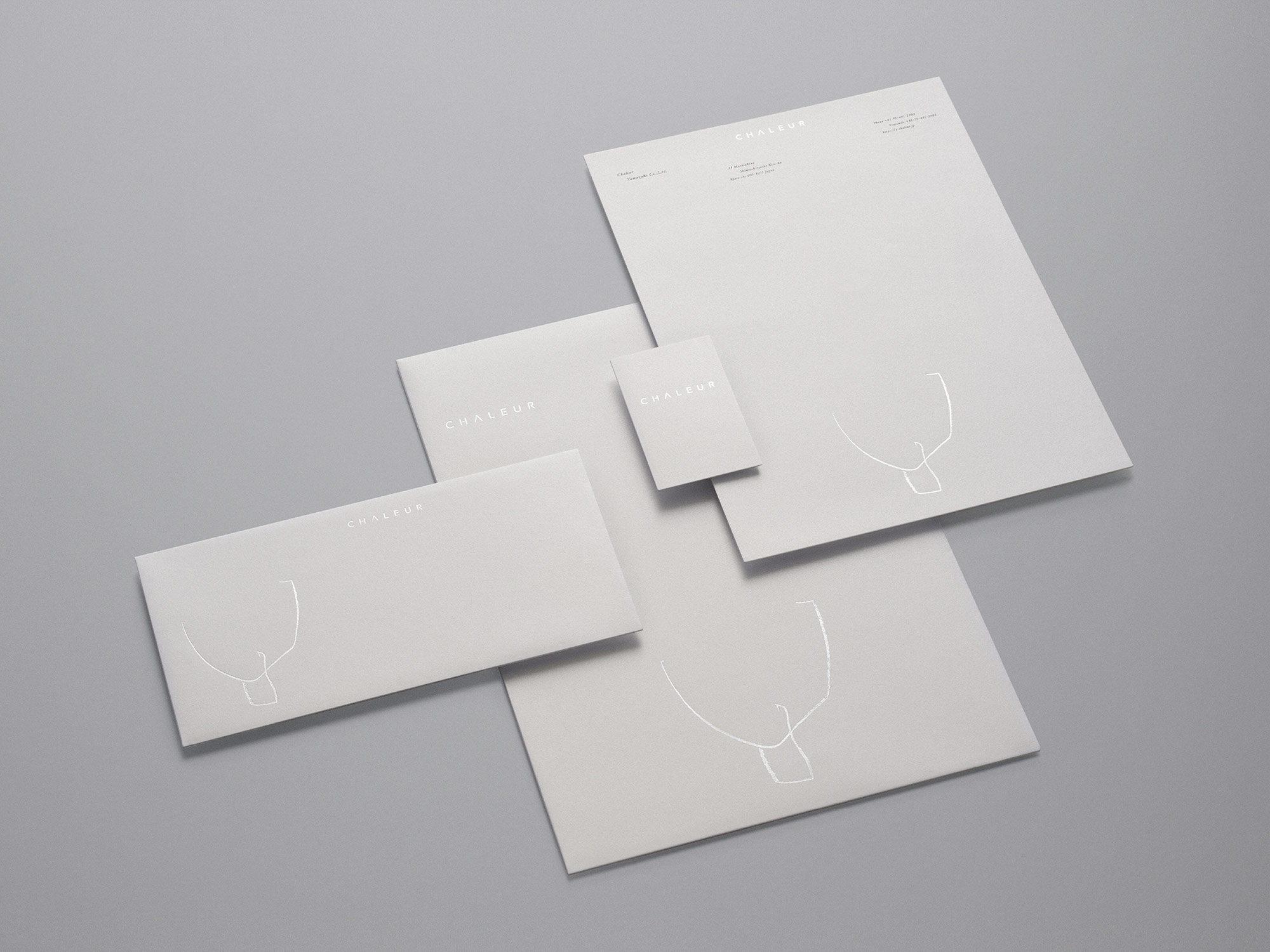
Business Card
Letterhead
C4 Envelope
DL Envelope
CHALEUR
Corporate Identity Design
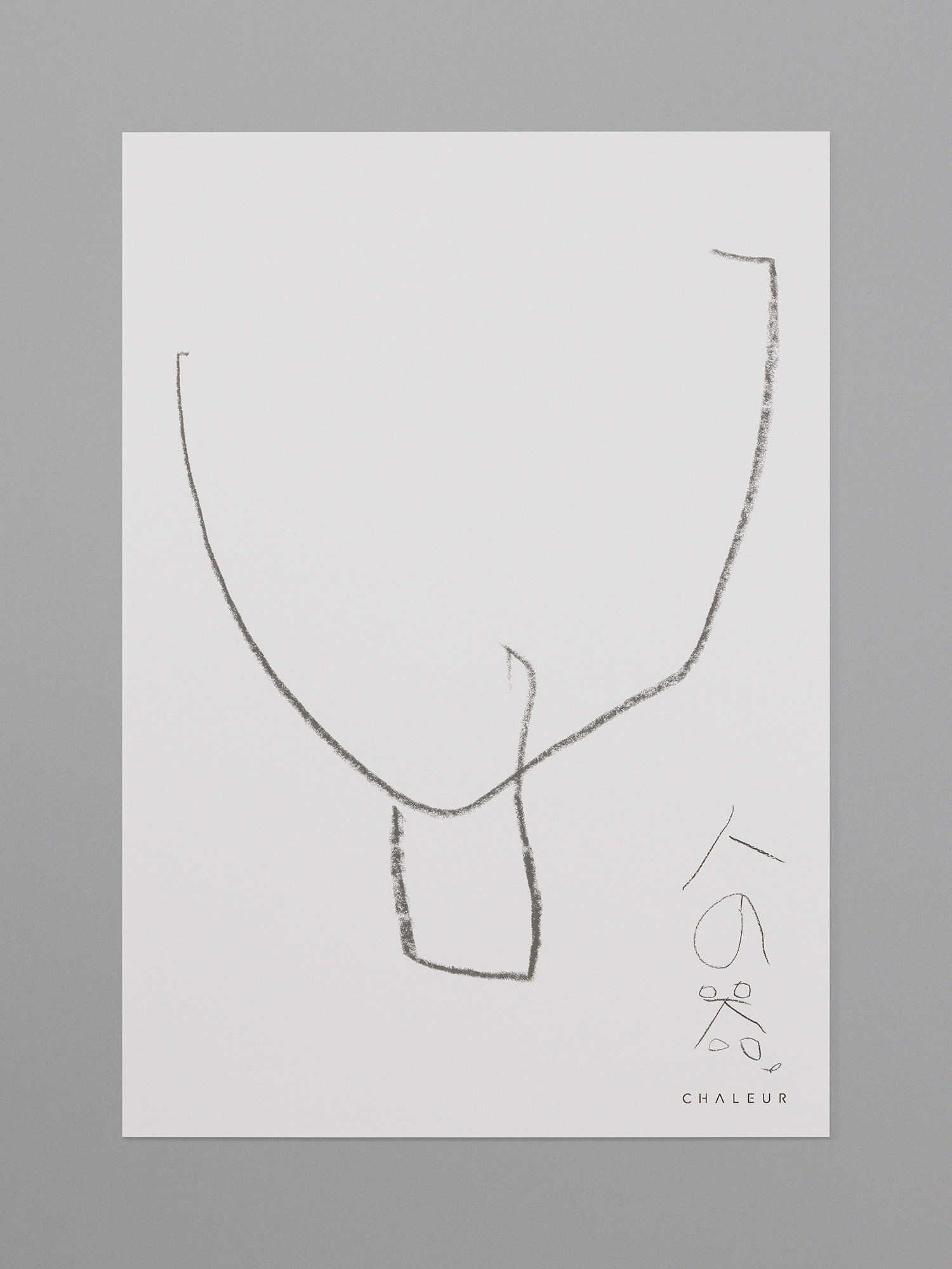
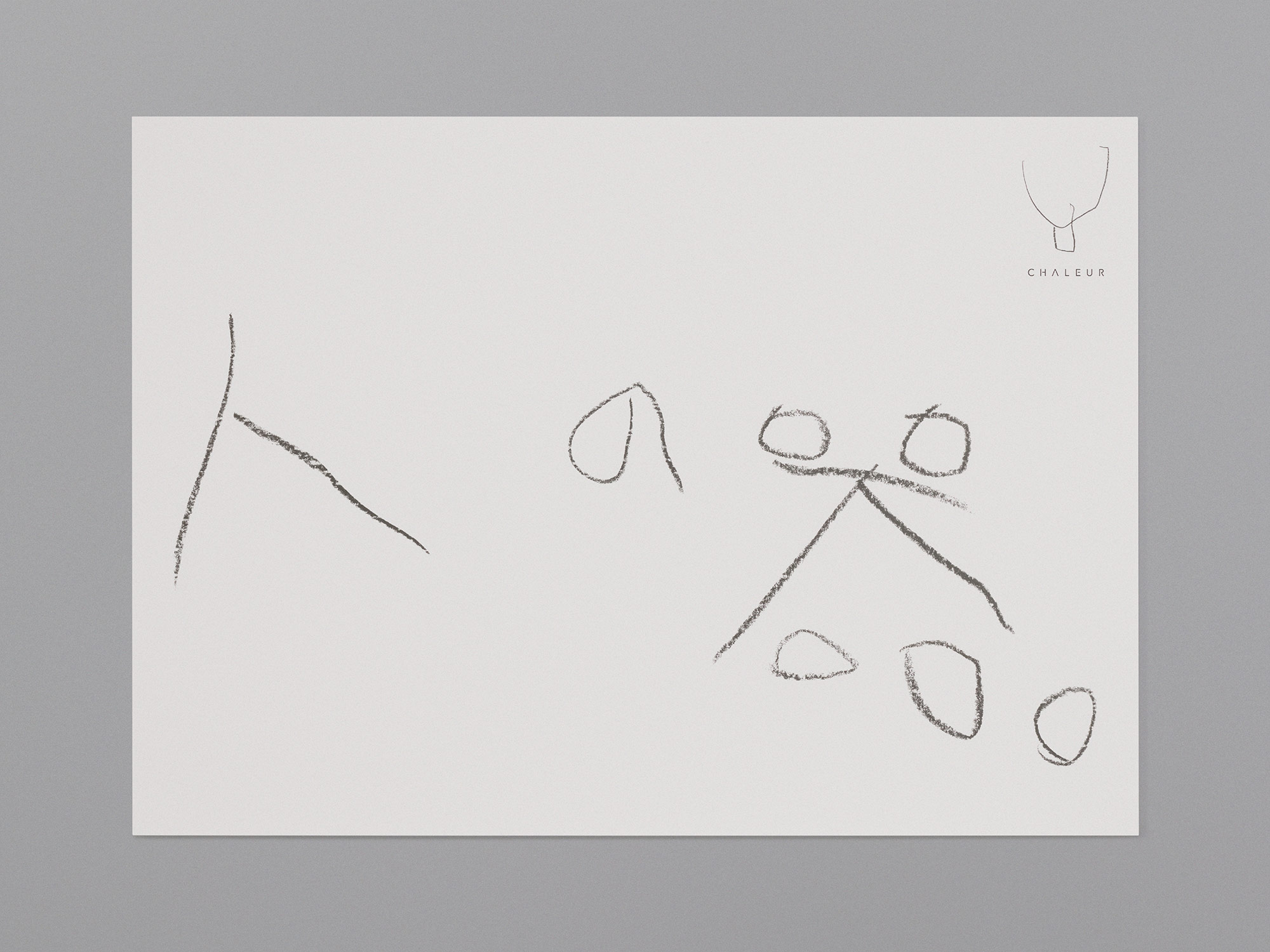
Symbol Mark Concept
Hito no Utsuwa (Human Vessel)
As a baby tableware brand, CHALEUR’s Corporate Identity
and symbol mark were art directed and designed to
feature a baby, an innocent child’s drawing, and a human face.
The child’s crayon drawing of a face is simple and
beautiful, reminiscent of a Matisse sketch. At the same time,
the face also resembles a piece of tableware. It invites
viewers to imagine multiple interpretations. The true essence
of a symbol mark lies in suggestion rather than explicit
explanation.
The face, drawn only as an outline, transcends nationality,
race, age, and gender. It becomes the face of all
humanity. It isa vessel. It is a human vessel—“Hito no Utsuwa.”
Therefore, CHALEUR’s tableware is not limited to
Japan, but becomes a vessel for the world, for people of all
ages, genders, and cultures.
CHALEUR entrusts the future of the earth to children,
believing in their power and courage to shape their own future.
For this reason, a child’s drawing was chosen as the
symbol mark.
The ultimate mission of CHALEUR’s Corporate Identity
design is to enable people around the world to carve out their
own futures and live happy lives simply through using
CHALEUR tableware.

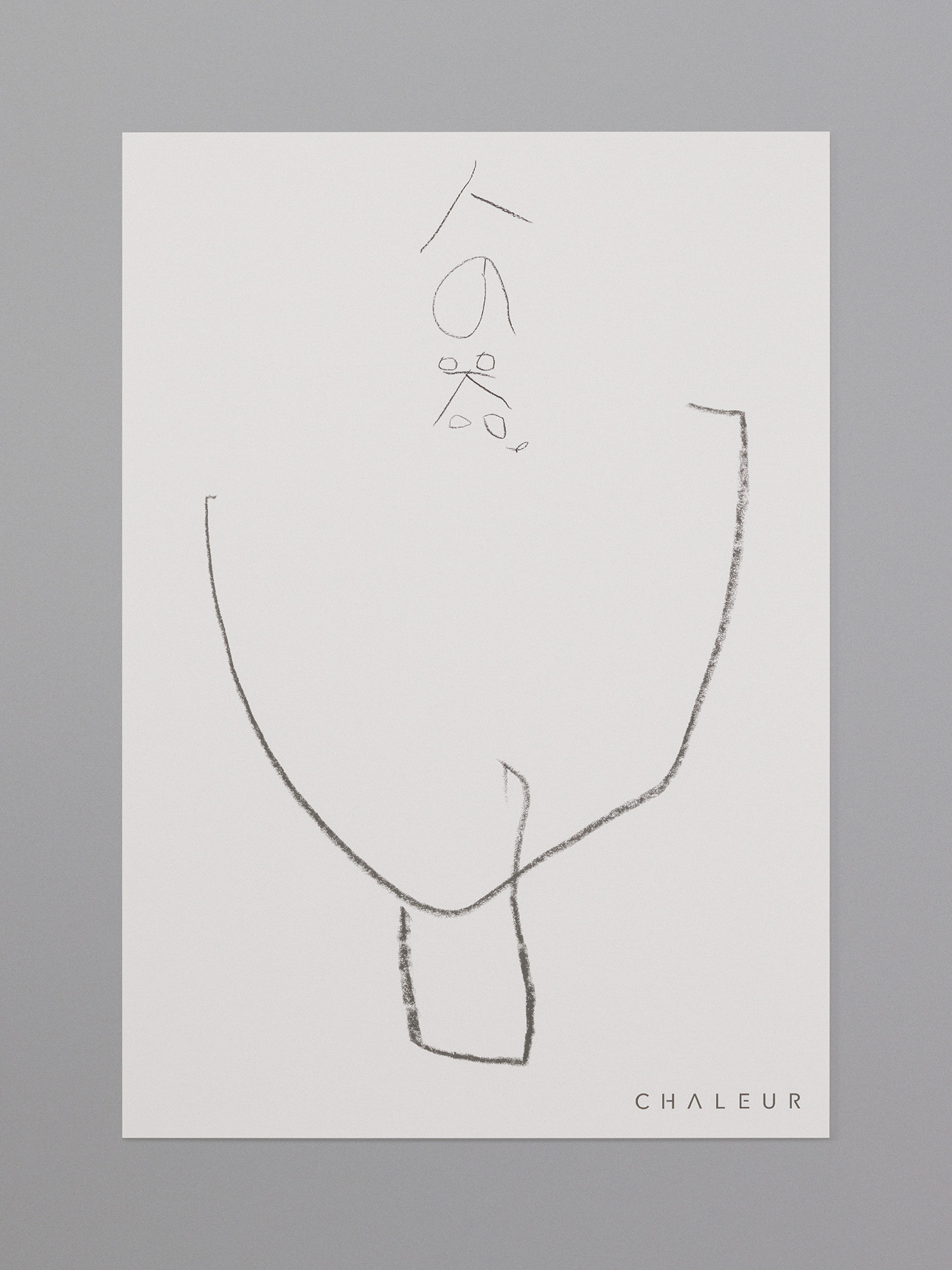
B1 Poster
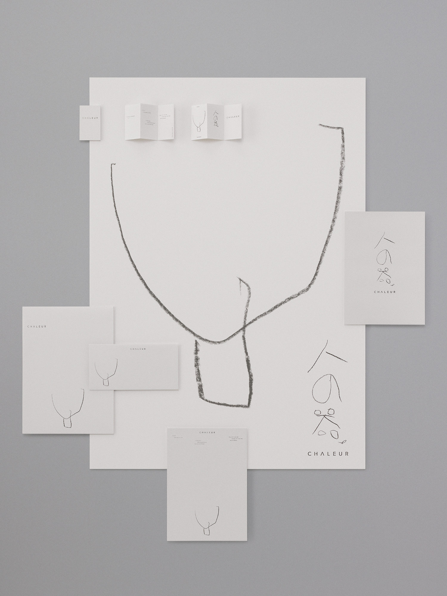
Business Card
Letterhead
C4 Envelope
DL Envelope
B1 Poster
CHALEUR
Corporate Identity Design
Corporate Slogan
CHALEUR’s corporate slogan, “Hito no Utsuwa” was
inspired by its symbol mark (both a person and a vessel) .
In Japanese, the word “Utsuwa” does not only mean
“tableware” but also a person’s inner capacity, emotional
richness.
Note:“Hito no Utsuwa” (Human Vessel) is CHALEUR’s
corporate slogan, presented as the native Japanese reading
of the original Japanese characters. In the Corporate
Identity design, stationery, and posters, this slogan is visually
expressed in its original Japanese characters.
AWARDS
・IF DESIGN AWARDS 2026(Germany)
Winner – Branding & Communication Design

・JAPAN TYPOGRAPHY ANNUAL 2026
Selected – Visual Identity
Selected – Graphic
CHALEUR
Corporate Identity Design
Creative Director
Prof. Hiromi Inayoshi
Art Director
Fumima Bando
Designer
Fumima Bando
Copywriter
Prof. Hiromi Inayoshi
Illustrator
Ao Bando
Photographer
Takashi Sekiguchi
Client
YAMAZAKI CO., LTD.